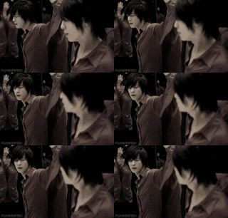
The first three show a lot of pixelation. This could either by from using a grainy image to start with or from not saving at a high enough quality, probably the latter. Several of them seem overly sharp, possibly due to resizing. 8 and 9 show this the most. Using a better quality image or cropping the image a bit smaller before resizing can help.
Textures can be a real pain at times. Try to pick ones that complement an image instead of compete with it. Don't let textures distract the eye from the focus of the icon. The texture in 3 wasn't bad color-wise, but the amount of white makes that bit of green at the top really stand out. 11 has way too many textures. Less is more. The design of the very bottom texture makes the icons very top heavy and the grunge texture over everything makes things feel a bit messy. The pepper texture is completely random. When erasing a texture from over another image don't leave white space like in 2. Either paint in some pink from the original image, or lower the opacity of the texture so you can see the image underneath as you erase. Try using a soft edged brush when erasing something like that.
Now that I've said all that you have some very nice crops, 3, 5, 6, 7, 8 in particular. If there is anything I'm personally most critical about in an icon, it's the cropping. A good crop can make or break an icon.
Are you using GIMP? A lot of the basics done in Photoshop can be done in GIMP as well, so go ahead and look at Photoshop tutorials. What can be done one way in Photoshop can often be done a completely different way in GIMP. ![[livejournal.com profile]](https://www.dreamwidth.org/img/external/lj-community.gif) gimp_tutorial,
gimp_tutorial, ![[livejournal.com profile]](https://www.dreamwidth.org/img/external/lj-community.gif) icon_tutorial, and this post (http://xxdarzie.livejournal.com/3875.html) have a lot of great tips for coloring and texture use.
icon_tutorial, and this post (http://xxdarzie.livejournal.com/3875.html) have a lot of great tips for coloring and texture use.
