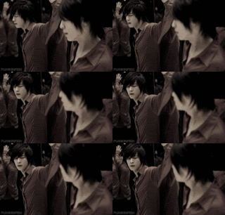
You should probably use some more high quality bases. All of these icons have a very grainy texture to it that doesn't jive well with the colors, which could probably be enhanced. I suggest playing around with layers more to bring out the colors you want.
Right now, otherwise, these look like flat crops.
|
May 2020
looking at you... only you

you, I can't forget you
|
|