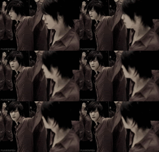
You know how much I adore your icons, I love how you can make the icons look so soft, but still not get rid of all the details.
But I agree with the two above me: sometimes, the light textures really take away from the icon. I love that you can make your icons pretty and sparkly, but you do try to do too much to them at times. Like the sixth one, it's really hard to tell what's going on (and I can only tell because I know the panel well and have seen the big version of it for your FST)
Sometimes I feel that you blur too much, to the point where it's not a nice softness but more of a blurry image.
So maybe cut down on the blurriness and the light textures? I adore your colouring skills, they're always so beautiful. All the colouring in these icons are amazing, but my favorites you listed are the ones that have minimal light textures on them (1, 2, 3, 8) And if those DO have a lot of light textures, you've set them up in a way that they don't detract from the overall image of the icon, but instead enhance it and make it prettier without washing the colours out.
....If I make any sense. God I fail at crit.
|
May 2020
looking at you... only you

you, I can't forget you
|
|